SBOM
February 19, 2025Comeo
A brand dedicated to patient-centered care
To represent our suite of software solutions, led by our flagship product ComeoCare, we wanted to embed meaning not just in the name but also in the logo. A meaning that reflects our values and symbolizes our partnership 🤝 with healthcare institutions to enhance patient care.
The name “Comeo” is transliterated from the ancient Greek κομέω and means « to take care » 💊.
We use it as prefix for our software products in the Medication Management field, like ComeoCare, ComeoBox and ComeoCheck to emphasise their shared purpose.
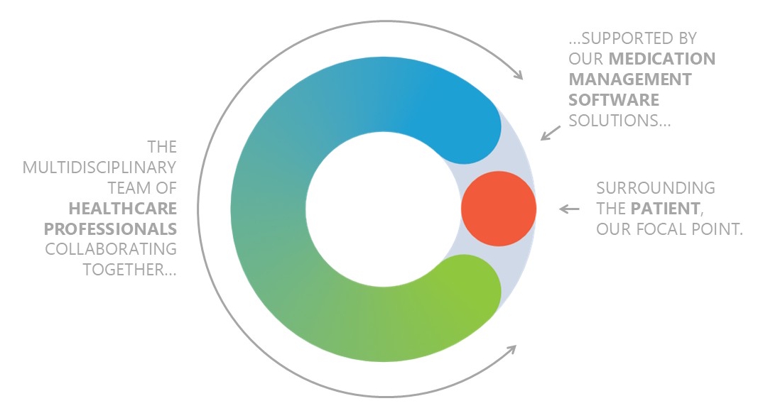
The Comeo logo also has a meaning representing our vision.
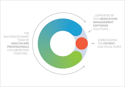
The logo features a gray circle representing our digital solutions, supporting a gradient-coloured C-shape that symbolises the collaboration of healthcare professionals — physicians, pharmacists, and nurses 👩🏼⚕️👨🏽⚕️. Together, they enclose a red dot at the center, signifying their shared focus: the patient.

At Comeo, every detail—from our name to our logo—reflects our unwavering commitment to patient care. By combining innovation, collaboration, and purpose, we strive to empower healthcare professionals with solutions that make a real difference 💪🏼.

